The Ubiquity project has been moving pretty quickly and despite the fact that I spend most of my time working on it, I actually have a hard time keeping track of its progress. At Labs we’ve talked about the idea of having “project dashboards” that present the latest developments on our projects, so I thought it might be a good opportunity to play around with new ways of visualizing community activity.
Most of the information I actually need to know about where Ubiquity’s at is actually contained in Planet Ubiquity; the problem for me is that some of the most important information I need, such as recent code commits, is actually contained way down in the sidebar of the page. And while I want different types of information to be spatially separated—so that I can just look at code commits without having to see blog posts, for instance—I also want them to be chronologically grouped so that it’s possible for me to see what’s happened with the project in the last 8 hours.
Here’s a screenshot of what I’ve got so far:
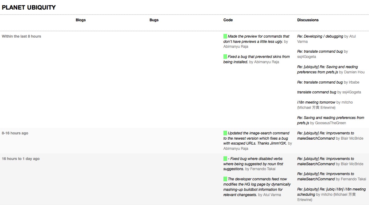
This visualization presents a grid whose columns represent different types of information for the project, and whose rows represent chronological “bins”. Each row is further colored to provide visual indication of how old the information is. The actual aesthetics here aren’t fully-formed yet—they’re actually just a modification of the stylesheet for my about:mozilla redesign—but the general grid concept is something that’s been simmering in my head for a while. As an active project contributor, it works well for me, though I’m not sure how suitable it is for the casual passerby who’s curious about where the project’s going.
Under the hood, everything’s implemented using client-side JavaScript and Google’s AJAX Feed API. Each column can include information from more than one feed; for instance, the “Code” column displays a colored square next to each HG commit indicating the result of the automated Buildbot tests for that revision.
Although this implementation is merely a prototype, I’ve tried making it decoupled enough to be reused as a general dashboard for any project; I’ve already spoken about this to Dan Mills, so we should have a Weave project dashboard soon.
To see the prototype in action, check out the Planet Ubiquity Redesign. I’ve tried it out in Firefox and Safari and it seems to work fine, but I wouldn’t be surprised if MSIE barfs on it at the moment. And because everything’s done on the client-side, JavaScript needs to be enabled.
I’ve also documented the code for anyone who’s interested.